library(tibble)
library(dplyr)
df_covid <- as_tibble(read.csv("owid-covid-data.csv")) Effective data visualization is at the cornerstone of data science research. The R programming language offers a robust plotting library - ggplot2. It is based on the tenets of grammar of graphics which imply that a graph is generated using layers of information including data, coordinates, and representations. We can further enhance the information conveyed by a graph by adding appropriate animations. The gganimate library has some useful functions that make it a breeze to animate graphs in R.
To learn how to make animated graphs, we'll use the Covid19 data from our world in data. First, let's make a simple plot showing the timeline of the total number of cases for India and the United States. We’ll make use of the tibble and dplyr libraries to parse the csv file having the Covid19 data.
df_covid# A tibble: 332,467 × 67
iso_code continent location date total_cases new_cases new_cases_smoothed
<chr> <chr> <chr> <chr> <dbl> <dbl> <dbl>
1 AFG Asia Afghanistan 2020… NA 0 NA
2 AFG Asia Afghanistan 2020… NA 0 NA
3 AFG Asia Afghanistan 2020… NA 0 NA
4 AFG Asia Afghanistan 2020… NA 0 NA
5 AFG Asia Afghanistan 2020… NA 0 NA
6 AFG Asia Afghanistan 2020… NA 0 0
7 AFG Asia Afghanistan 2020… NA 0 0
8 AFG Asia Afghanistan 2020… NA 0 0
9 AFG Asia Afghanistan 2020… NA 0 0
10 AFG Asia Afghanistan 2020… NA 0 0
# ℹ 332,457 more rows
# ℹ 60 more variables: total_deaths <dbl>, new_deaths <dbl>,
# new_deaths_smoothed <dbl>, total_cases_per_million <dbl>,
# new_cases_per_million <dbl>, new_cases_smoothed_per_million <dbl>,
# total_deaths_per_million <dbl>, new_deaths_per_million <dbl>,
# new_deaths_smoothed_per_million <dbl>, reproduction_rate <dbl>,
# icu_patients <dbl>, icu_patients_per_million <dbl>, hosp_patients <dbl>, …library(ggplot2)
library(ggthemes)
countries <- c("India", "United States")
## maximum number of cases for countries.
max_vals <- df_covid %>%
group_by(location) %>%
filter(location %in% countries) %>%
slice(which.max(total_cases)) %>%
pull(total_cases)
last_date = tail(df_covid$date,1)
df_covid %>%
mutate(date = as.Date(date)) %>%
group_by(location) %>%
filter(location %in% countries) %>%
ggplot(aes(x=date, y=total_cases, color=location)) + geom_point() +
scale_y_continuous(labels = scales::comma) +
annotate("text", label=countries[1], x=as.Date(last_date),y=max_vals[1], vjust=2) +
annotate("text", label=countries[2], x=as.Date(last_date),y=max_vals[2], vjust=2, hjust=0.75) +
theme_clean() + theme(legend.position = "none")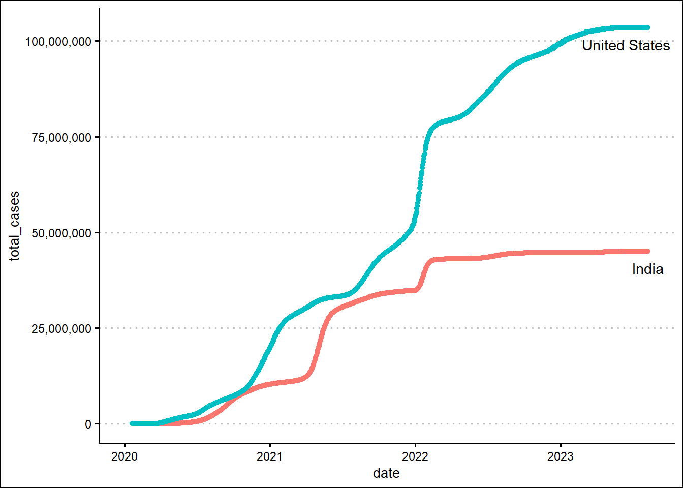
Next, we'll animate the timeline using the transition_reveal function from the gganimate library.
library(gganimate)

df_covid %>%
  filter(location %in% c("India", "United States")) %>%
  mutate(date = as.Date(date)) %>%
  ggplot(aes(x=date, y=total_cases, color=location, label=location)) + geom_line() +
  scale_y_continuous(labels = scales::comma) +
  theme_clean() + theme(legend.position = "none") +
  labs(title = 'Date: {frame_along}') +
  transition_reveal(date) +
  geom_text(aes(label=location, group=location))
`geom_line()`: Each group consists of only one observation.
ℹ Do you need to adjust the group aesthetic?
To enhance the information in the graph, we’ll make a scatter plot and change the marker size based on daily new cases.
Show the code
df_covid %>%
  filter(location %in% c("India", "United States")) %>%
  mutate(date = as.Date(date)) %>%
  ggplot(aes(x=date, y=total_cases, size=new_cases, color=location)) +
  geom_point() +
  scale_y_continuous(labels = scales::comma) +
  theme_clean() + theme(legend.position = "none") +
  labs(title = 'Date: {closest_state}') +
  transition_states(date) +
  ease_aes('linear') +
  shadow_trail(distance = 0.01, alpha=0.25)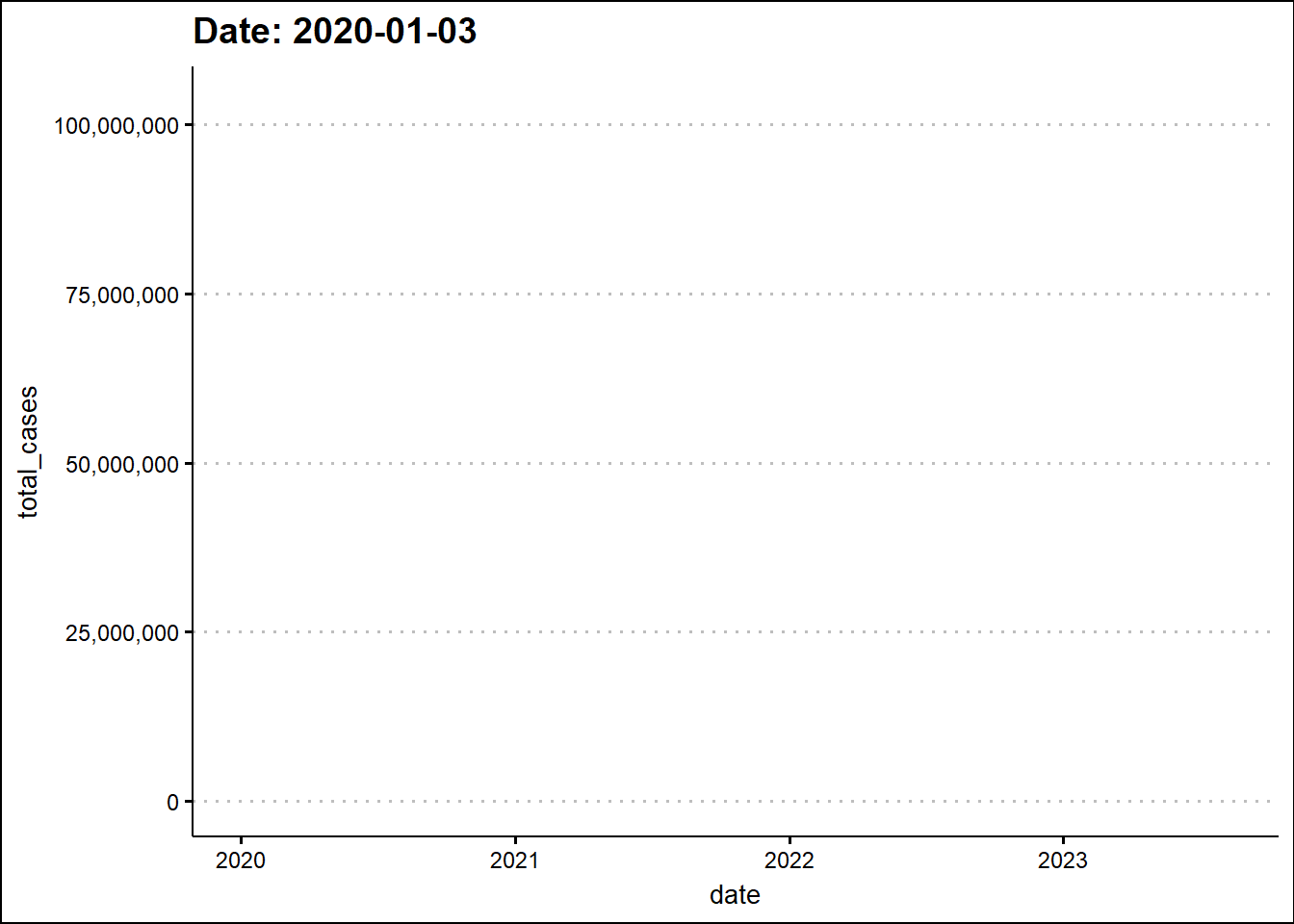
The animated graph draws our attention to some patterns that were not as evident - to the untrained eye - in the static graph. For example, around the beginning 2022, the two dots elevate in a synchronized manner indicating a temporal overlap of the third wave in India with the wave in the USA. In the previous two waves there was a time difference between the two countries.