import pandas as pd
import matplotlib.pyplot as plt
data_URL = "https://raw.githubusercontent.com/owid/covid-19-data/master/public/data/owid-covid-data.csv"
df_covid19 = pd.read_csv(data_URL)Finding peaks in Covid19 data using SciPy library.
Introduction
A plot of the total number of cases over a period of time gives a visual representation of the emergence of cases, which helps to understand the progression of the disease over time. In addition to plotting total cases over time, we can also plot the number of new cases per day over a period of time. This curve helps us visualize the waves i.e. the occasional significant increase (and decrease) in the number of new cases overtime. In this graph there will be some regions where the number of cases would be very high – peaks. Let’s make these graphs using the data available from Our World in Data.
df_covid19.head()| iso_code | continent | location | date | total_cases | new_cases | new_cases_smoothed | total_deaths | new_deaths | new_deaths_smoothed | ... | female_smokers | male_smokers | handwashing_facilities | hospital_beds_per_thousand | life_expectancy | human_development_index | excess_mortality_cumulative_absolute | excess_mortality_cumulative | excess_mortality | excess_mortality_cumulative_per_million | |
|---|---|---|---|---|---|---|---|---|---|---|---|---|---|---|---|---|---|---|---|---|---|
| 0 | AFG | Asia | Afghanistan | 2020-02-24 | 5.0 | 5.0 | NaN | NaN | NaN | NaN | ... | NaN | NaN | 37.746 | 0.5 | 64.83 | 0.511 | NaN | NaN | NaN | NaN |
| 1 | AFG | Asia | Afghanistan | 2020-02-25 | 5.0 | 0.0 | NaN | NaN | NaN | NaN | ... | NaN | NaN | 37.746 | 0.5 | 64.83 | 0.511 | NaN | NaN | NaN | NaN |
| 2 | AFG | Asia | Afghanistan | 2020-02-26 | 5.0 | 0.0 | NaN | NaN | NaN | NaN | ... | NaN | NaN | 37.746 | 0.5 | 64.83 | 0.511 | NaN | NaN | NaN | NaN |
| 3 | AFG | Asia | Afghanistan | 2020-02-27 | 5.0 | 0.0 | NaN | NaN | NaN | NaN | ... | NaN | NaN | 37.746 | 0.5 | 64.83 | 0.511 | NaN | NaN | NaN | NaN |
| 4 | AFG | Asia | Afghanistan | 2020-02-28 | 5.0 | 0.0 | NaN | NaN | NaN | NaN | ... | NaN | NaN | 37.746 | 0.5 | 64.83 | 0.511 | NaN | NaN | NaN | NaN |
5 rows × 67 columns
df_covid19['date'] = pd.to_datetime(df_covid19['date'])
plt.rcParams.update({'font.size': 16})
fig, (ax1,ax2) = plt.subplots(2,1,figsize=(10,6), sharex=True)
(df_covid19.groupby("location")
 .get_group("India")
 .plot("date","total_cases", ax=ax1, legend=None)
)
(df_covid19.groupby("location")
 .get_group("United States")
 .plot("date","total_cases", ax=ax1, legend=None)
)
(df_covid19.groupby("location")
 .get_group("India")
 .plot("date","new_cases", ax=ax2)
)
(df_covid19.groupby("location")
 .get_group("United States")
 .plot("date","new_cases", ax=ax2)
)
ax1.spines[["top", "right", "bottom"]].set_visible(False)
ax2.spines[["top", "right"]].set_visible(False)
ax1.get_xaxis().set_visible(False)
plt.xlabel("Date")
ax1.set_ylabel("Total Cases")
ax2.set_ylabel("New Cases")
plt.legend(["India", "United States"],loc=9, ncol=2,bbox_to_anchor=(0.5, 1.15))
plt.tight_layout()
plt.show()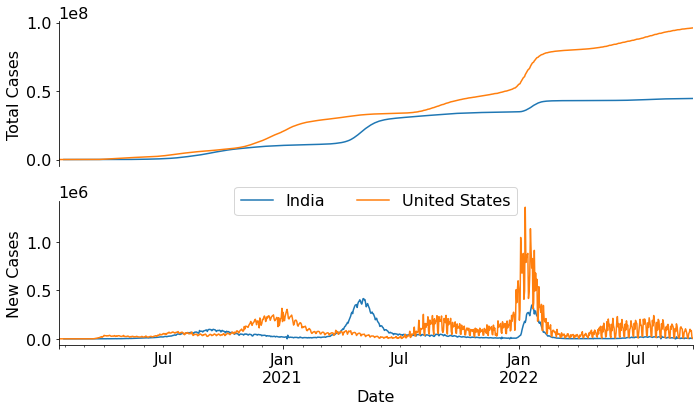
Peaks in a curve
The SciPy library has a find_peaks function to identify peaks in a curve. We’ll use this function to algorithmically find peaks in the new_cases vs time curve and use that information to decorate the total_cases vs time curve. There could be mutiple dates where the new cases are increases and then drops down. Each of these would considered as peak. So, we need to apply a threshold for number of cases to select relavent peaks. For this example, we’ll select peaks where the number of cases is more than 300000. Note, if we change this cutoff (peak height) or change other parameter (such as peak width), the total number of peaks would be different. The find_peaks function returns a tuple with two elements, the first one being the location of the peaks. The second one is a dictionary having details about the peak such as peak height.
from scipy.signal import find_peakspeaks_India = find_peaks(df_covid19.groupby("location").get_group("India")["new_cases"] ,\
prominence=1, height=300000, width=5)
peaks_USA = find_peaks(df_covid19.groupby("location").get_group("United States")["new_cases"],\
prominence=1, height=300000, width=5)peaks_India(array([462, 721], dtype=int64),
{'peak_heights': array([414188., 347254.]),
'prominences': array([414188., 347254.]),
'left_bases': array([344, 687], dtype=int64),
'right_bases': array([674, 920], dtype=int64),
'widths': array([39.20544708, 20.63802764]),
'width_heights': array([207094., 173627.]),
'left_ips': array([440.38250873, 711.20872566]),
'right_ips': array([479.58795581, 731.84675331])})Now let’s overlay the peaks on the total cases vs time graph. We’ll scale the peak heights and use it for the size argument of the scatter plot.
fig, ax = plt.subplots(figsize=(10,4))
(df_covid19[df_covid19.loc[:,"location"]=="India"]
 .plot("date","total_cases", ax=ax)
)
(df_covid19[df_covid19.loc[:,"location"]=="India"]
 .iloc[peaks_India[0]]
 .plot("date","total_cases", s=peaks_India[1]["peak_heights"]*2/10000, \
       kind="scatter",ax=ax, legend=False)
)
(df_covid19[df_covid19.loc[:,"location"]=="United States"]
 .plot("date","total_cases", ax=ax)
)
(df_covid19[df_covid19.loc[:,"location"]=="United States"]
 .iloc[peaks_USA[0]]
 .plot("date","total_cases", c="C1", s=peaks_USA[1]["peak_heights"]*2/10000, \
       kind="scatter",ax=ax, legend=False)
)
ax.spines[["top", "right"]].set_visible(False)
plt.xlabel("Date", fontsize=20)
plt.ylabel("Total Cases", fontsize=20)
handles, labels = ax.get_legend_handles_labels()
ax.legend(handles, ["India", "United States"])
plt.savefig("covid19_timeline.png")
plt.tight_layout()
plt.show()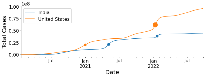
This is an effective way to summarize the relevant data in a single graphical representation. The dots represent Covid19 waves (see the bottom graph in the first figure) and the size of the dots is proportional to the intensity of the wave.